
When you relate design with Japanese style, you can probably think of minimalism, the art of simplifying that has now become one of the most influential design movement in the world. Simply because it’s just about throwing the excess bits away and keeping he only essence. It’s a bit like sushi, simple ingredients, no complicated garnish whatsoever, and doesn’t even need any utensils to eat. But anyway, we all knew that minimalism isn’t going to be that simple, will it? And definitely not every brand in the world can pull off the trick as good as the Tokio, especially when it’s created entirely out of… lines.


“… throwing the excess bits away and keeping he only essence.”

Japanese styling in a non-sushi country
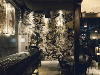
Like the Mikoto and Nokomi Sushi Bar, the Tokio too shows no mercy to the courage of applying authentic, full-on Japanese styling in non-sushi foreign countries (which in this case, Budapest, Hungary). Well, for most foreign Japanese restaurants, they prefer branding that brings back the original flavor of Koi fish-ish design style into modern mix. However, Tokio (branding designed by Eszter Laki) doesn’t care about bringing the old stuffs back. What they want, is a sushi bar that features all the contemporary, hispter design style. Neon lights and some robots, I guess you can see where they’re going. Though robots might be a complicated thing, but Eszter managed to create the whole branding with no flimflams straight lines. No colors even. I don’t think you can tell the difference from grayscale pictures.


“… full-on Japanese styling in non-sushi foreign countries.”


The menus may come with foods, instructions and descriptions, yet you can still definitely understand all of it just by looking at the graphics. Remind you of anything? Throwing excess bits and keeping the essence? Yup, it’s the same story with the logotype, which is designed to look and feel like Japanese words, and at the same time still unmistakably readable as ‘Tokio’.


Little things that make Tokio a different place
Some says that “there is a great deal sophistication behind every great simplicity”. And truth be told, it does, but not in a way that I could explain it. It’s all just about the little details that make the whole thing very personal. Like the robots grabbing chopsticks as the way those first-timer did. I know it didn’t sound as significant as you might expect, at least it does do the world a favor by ensuring you that help is in hand anytime you need it. Then there’s the wasabi sauce that appears to be contained in a squeezable arcylic-paint-like packaging. Again, makes you want to squeeze it on top of every single bite.


“… there is a great deal sophistication behind every great simplicity”


“What pops into your mind when you think about Tokyo and Japan? Ancient traditions and flickering neon lights. A monk rings a bell and a busy business man running with a suitcase in his hand. Working on these concepts and focusing on specific contrasts, the design process evolved into three different topics, representing the Tokyo’s scenarios variety and Japanese tradition, too.”
Project: Tokio
Branding by:
Interior by: and
Photography by:
Place: Budapest, Hungary