
It is a sunny, blue-sky morning on Saturday. Imagine you walk into a local grocery warehouse to do your weekly grocery shopping. Workers moving about behind the scene, carrying goods in wooden crate with both hands from one place to another. Groups of fresh green pepper and unpeeled pinkish onion displaying in front you in old weaved sacks with its opening rolled inside out. You look at the price written in chalk on a cardboard. Then, an approaching worker handed over a medium-sized box for you to carry your goods.
This might be a scene that only exists in the past, unless you happen to walk into the Obbio warehouse in Barcelona, a supermarket that will causes you all the way back into the good old days.
Yes, Obbio is a place for organic lovers who are interested in healthy eating and lifestyle. It’s a supermarket offering a wide range of organic and vegetarian products. Besides, Obbio also has an in-house cafeteria and a library full of carefully selected healthy-eating-related books, creating a sense of community around the idea of healthy lifestyle.


So how do they do it? Well, Mayúscula uses the traditional warehouse concept as a starting point, drawing inspiration from the elements you can easily find on traditional merchandise (from stencil stamp, etched printing, weaved sacks, just to name a few) and put them as the theme of Obbio’s brand identity.


Honestly, I can’t see an obvious relationship between the warehouse design theme and the organic concept supermarket. Is it just a healthy 21st century person dressed up as a Victorian merchant? But who cares, really, in a design that looks this bold and inspiring.
Interestingly though, it’s not just all about the look that I like. The grocery-inspired box structure, for example, is used as a separator (or an organizer, if you like) for the information displayed on the compact packaging label. They put each different elements (name, category, drawings, ingredients, and price) into each well-ordered box, so that you can scan through the whole item at first glance (unless you speak Spanish).


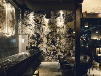
Noticed the stencil-cut everywhere? Yup, Mayúscula design it that way to trace their routes back to the traditional warehouse concept, again, where all the words printed on old merchandise are in stencil type. It’s pretty much the same story with the etched illustration. And to make sure water flows into every stream, Mayúscula also extends the usage of the brand’s design cues towards every corner of the Obbio store both physically and digitally.


I have to say, you’ll never really get bored with the Obbio’s design. Anyway, this post is just an excerpt of the original one that I sourced from. If you crave for more, you can (and should) visit Mayúscula’s Obbio Branding and Obbio by BP&O. Thanks for watching!
And, in the mean time, you can also link to these related articles for your self-enrichment,